[WP] Using Blocks Editor
When not to use block editor
- When you create simple gallery and want to add title of it to each image (use Caption option instead). - When block is present on every slide and has same pattern (use Slide markup editor to create layout once).Realigning and repositioning blocks on different screen sizes
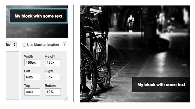
In block editor you can use relative properties like percents or em's to position block dynamically.
Screenshot shows options to position block in right bottom corner with 10% distance from bottom:
Now, for example, on small screen sizes (< 500px) you want this block to be displayed as a strip at the bottom of slide and with slightly smaller font size. To implement this make sure that some class is selected in "Block CSS Class" select box.
CSS code below can be added to any CSS file on page, for example to styles.css of your theme. If you selected block with name: abBlackBox:
@media screen and (max-width: 500px) {
  .abBlackBox {
      /* Change bottom value from 10% to 0 to position it at the bottom */
      bottom: 0 !important;

      /* Change left to 0 to make block stretch to full width */
      left: 0 !important;

      /* Change width to auto */
      width: auto !important;

      /* change font size to 12px */
      font-size: 12px !important;
  }
}
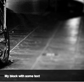
CSS above will render block on devices with screen size less than 500px positioned like on screenshot below:
If you're new to HTML/CSS and you wish to build responsive websites that don't suck, I recommend starting from video courses from Treehouse or checking tutorials by Smashingmagazine.
Can I force specific height to slider itself
/* will force 300px height of the slider when width of a window is less than 500px */
@media screen and (max-width: 500px) {
  .royalSlider {
      height: 300px !important;
  }
}
How to add animated block directly in slide markup
Example of title in animated block:<div class="rsABlock" data-move-effect="">{{title}}</div>
Read more in docs of HTML version.
Why RoyalSlider doesn't scale blocks automatically
The whole point of responsive design is to provide content that is accessible on any screen size and every device. If we just squish the content proportionally - there no point of "responsiveness" - everything is the same as it was before. If you use non-responsive theme - you'll get same effect. Screenshot below shows the problem of this technique and how text looks when is scaled down automatically: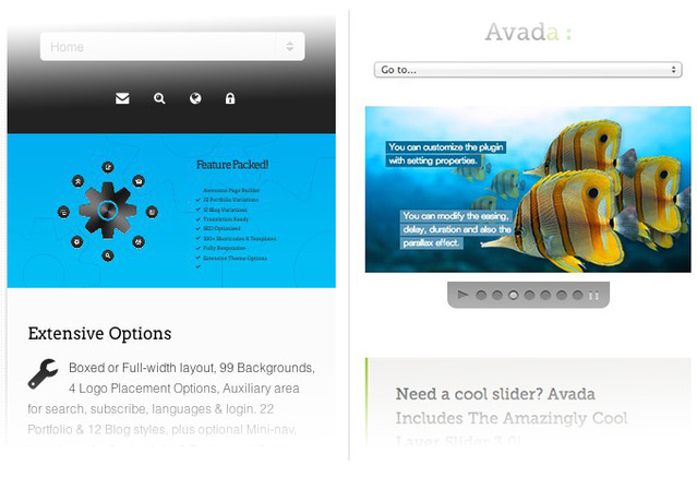
Screenshots of slideshows in Elemis and Avada themes
How to add new CSS class to block editor
Open block editor, select from dropdown
>> Add New Class <<and enter class name. For examplemy-custom-class.If you added custom CSS skin, go inside its CSS file and apply your styling. You can also paste this code into some CSS file on page with slider, but it will not be visible in admin in this case. For example:
.my-custom-class {
    color: red;
}
3) In block editor, click on some block and select your created CSS class to apply it.